친구를 초대하고 둘 다 무료 코인을 받으세요

6581
Aman Aga
스케치 렌더링
v2 
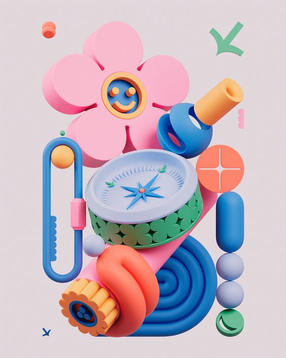
The image displays a pie chart with three segments, each representing a different color and percentage value. The top segment is blue and appears to be the largest, indicating it represents the highest percentage value. Below that is a red segment, which is smaller in size and contains a lower percentage value than the blue segment. The bottom segment is green and is the smallest of the three, suggesting it has the lowest percentage value. The background of the image is black, which contrasts with the vivid colors of the pie chart. There are no texts or additional objects present in the image.

스타일:
3D-3D 캐릭터
모드:
구조
시점:
정면도
1
리믹스
0
좋아요아직 댓글이 없습니다
더 비슷한 내용
6581
Aman Aga
스케치 렌더링
v2 
The image displays a pie chart with three segments, each representing a different color and percentage value. The top segment is blue and appears to be the largest, indicating it represents the highest percentage value. Below that is a red segment, which is smaller in size and contains a lower percentage value than the blue segment. The bottom segment is green and is the smallest of the three, suggesting it has the lowest percentage value. The background of the image is black, which contrasts with the vivid colors of the pie chart. There are no texts or additional objects present in the image.

스타일:
3D-3D 캐릭터
모드:
구조
시점:
정면도
1
리믹스
0
좋아요아직 댓글이 없습니다


